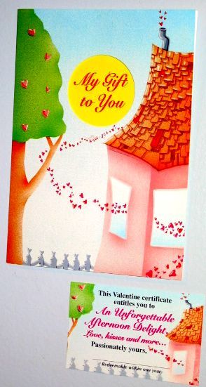
Friday, February 24, 2006

Illustration Friday: Tea


My submission to Illustration Friday for the theme Tea is Tea House. This illustration comes from my 2001 HomeMade calendar for the month of August. You know, Tea House of the August moon? ( for you younguns that was a play and a movie starring Glenn Ford).I realized all these months I have been remiss in telling you which month these illos were created for and the quote that goes with the picture. I spent years coming up with ideas, creating the 65 paintings, making them fit with particular months and collecting quotes my whole life about houses and homes. So now you know, it is not just a passion but an obsession...

The quote: "Things taste better in small houses" - Queen Victoria

copyright 2000

Tuesday, February 21, 2006

"Swept Away"


In 1982 I made a painting called "Swept Away" and people really seemed to like it. It was a european street scene that had hearts scattered all over the street and gathered up in piles and in a cart by the street sweeper. Like the morning after the lovers had gathered in the cafes shared their love and left some hearts behind. I got this idea after spending time with this amazing artist Sid Francis. His whole life's philosophy was being a loving person. So Sid inspired this painting. I named the building in the forefront "Sid's Cafe" and a menu states: Love served Monday thru Sunday. Sid was a master printer in the art of plate lithography. Very similar to the old stone method but you use emulsified plates that get exposed with separations that you cut out of amberlith like silkscreening. Each colour is printed separately and this was a 35 colour print,so each piece of paper goes under the press 35 times! And you the artist, need to know how to make separtions that register together perfectly so it all fits together like a puzzle. I love this method of printing which is rare and hard to do and I have been a printmaker for years. I recognised very early on in my career that if you want to reach more people you need multiples and printing helps achieve that goal. My publisher paid for the printing of "Swept Away and every day I got to drive a few minutes to Sid's house on Cheney Road in Topanga where he and his family lived and for a solid month we worked on this print and it was one of the best experiences of my artistic life. We created this print together in 1984 on an old Heidelberg press and in 1985 the Los Angeles Times created a full colour supplement to feature artists from the Santa Monica area and they chose "Swept Away" for the very first cover. These pictures were taken in the studio I had in the early eighties for this article. You had to cross a wooden rope bridge and it was so high up you felt as though you were in a tree house. A wonderful couple I know bought the original 20 years ago and it makes me happy that the painting has always lived here in Topanga.

photos: courtesy Tim Boyd Smith (Forgive the hair it was the eighties!)
Cover Centerpiece Magazine LA Times "Swept Away" 1985
Press Release Luna Art copyright 1984

Friday, February 17, 2006

Illustration Friday: Song

My submission for song is "Music House". It is an illustration from my 2004
HomeMade calendar. Music and song makes everything seem better! copyright 2003

Friday, February 10, 2006

Illustration Friday: Simple


Sometimes the simple things are the best! "Hen House" is from my 2002 HomeMade calendar copyright 2001

Wednesday, February 08, 2006

Valentine 7,8,9


all Valentines by Marisol / Valerie Walsh 1995

Valentine 4,5,6

More fun Val-entines


Sunday, February 05, 2006

5 strange things


I got tagged by Maria Antunes www.pimpolhices.blogspot.com I love her blog and work and she has asked 5 strange things about me. I am not sure how strange they are but here goes:

1. My mother was born in Boyle Heights in Los Angeles, CA. She was discovered on the streets of Hollywood by a producer because she looked a little like Shirley Temple and she was a darling little girl. My grandmother took her to the studios on the behest of this producer and she would not stop crying so they sent her home. I was born in San Diego, Ca and when I was a little girl I was discovered by a man in television who thought I had a great singing voice and wanted me to do some tests. My mother refused.
2. The first professional illustration job I got was drawing a picture of a dancer wearing a certain type of clothing that dancers prefer. I was 19, it was published in an issue of Dance Magazine and trust me it was atrocious. Strange that it ever got published it was that bad!
3.I like to do the same things everyday at the same time. I don't have to but I feel best if I do because I have worked at home for so long that I need to have a routine like people do at a regular job so I manage my time this way and I don't answer the phone while I am working.
4. I drink coffee in the morning and 1 cup in the afternoon as a boost and I only drink pure cranberry juice unsweetened diluted with water all day every day.
5. I have lived in very remote areas of Topanga Canyon and spend enormous amounts of time alone and I never feel afraid or alone. I have gone weeks without seeing or talking to people and I find it totally delightful! Before I was married of course.
Left: my mom "Babs" Right: val

Saturday, February 04, 2006

Valentine 3

Top: Front of card / middle : interior/ bottem: original illustration "Breakfast in Bed " copyright 1995

Who wouldn't like to receive this? Breakfast in bed anyone?

Friday, February 03, 2006

Illustration Friday: Chair


This is a dimensional painting I made as part of a show in 1987 called "Five Easy Pieces". Each painting features household items (chairs, tables, vanity, chaise lounge, and the kitchen sink), the title of each painting alluded to what the item was and they all rhymed. It was "Vanity ", "Charity", "Chastity", "Synchronicity" and "Stability". The chairs are heart shaped as in heartfelt charity raining down on the big cold city. This one was purchased by Daryl Hannah (yes, that Daryl Hannah)
and her sisters for her stepfather Jerry Wexler. He lives in Chicago and is a major real estate mogul and probably gives a lot to charity. I was thrilled that it would go to such a prominent Chicago family! This painting was made into a poster as well. Of course there is always a little synchronicity too because my husband John produced a movie when he was younger and it starred a young Kim Basinger in her first starring role in a feature, Jan Michael Vincent, Michael Parks, Tanya Tucker and Daryl Hannah. The film was called "Hard Country". It was not the greatest movie ever made but it did have a wonderful cast.

I know it seems like I am always posting old work and that is because I have spent my entire life making art. I have an enormous body of work and coincidentally it seems to be coming back to life through IF and my blog. I still paint every day and will show more current work in the future.
copyright 1987

Thursday, February 02, 2006

Valentine 2


All of the Marisol Valentines that I made were for adults and have slight adult themes which I am sure you could tell by yesterday's "Afternoon Delight". Even so, I made them with a happy, fun and whimsical touch. This valentine is more relevant to everyone. These cards that have the certificate in the diecut holder are called Hidden Treasures.
top: greeting card middle: interior with gift certificate bottem: original acrylic on airbrush paper copyright 1995

Wednesday, February 01, 2006

Valentine 1


"Afternoon Delight"

I love Valentines. It's not about the holiday or receiving them or any of the mushy or commercial aspects of Valentines day. I frankly find all of that annoying! It is the remembrance of things past, of when we were small and we bought those boxes full of cards and made one for all of our friends and the teacher would set aside some time to be together and open them, read them, eat candy together and laugh and swoon about the cute boy that gave me one...

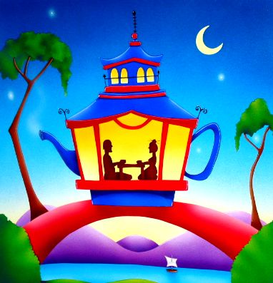
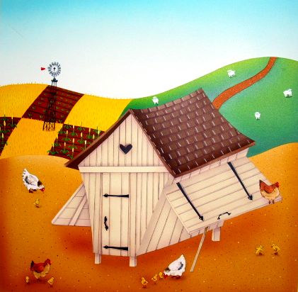
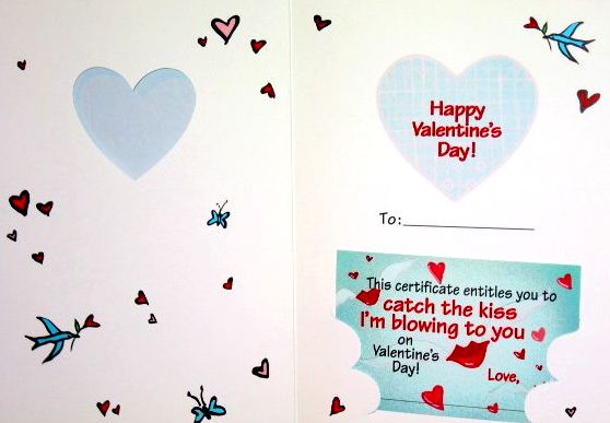
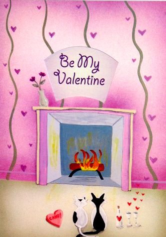
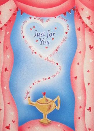
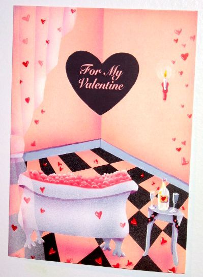
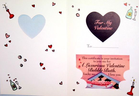
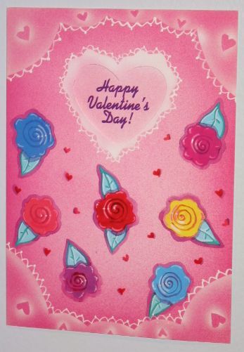
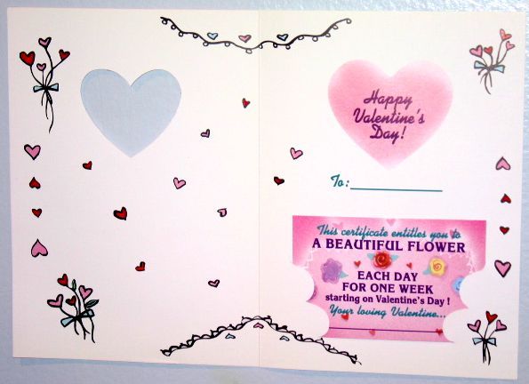
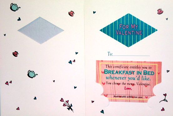
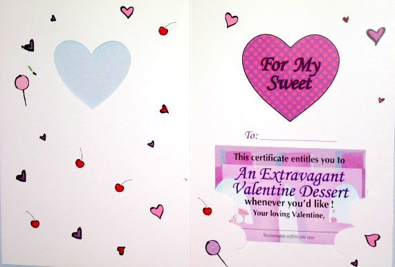
I have made at least 100 different images for card companies to be used for Valentines. I love making them even more than receiving them. I wanted to show some examples of the unique cards that I have made for this occasion. The example I am showing today is by Marisol Inc. The reason I loved doing cards for them is that they would send me a sheet of words and I got to create whatever I could dream up as long as it fit within the template and utilized the words. I would always try to fit a house in the picture which was not easy but for this Valentine it really worked well. For Marisol's everyday line and Valentines I was required to make 4 individual pieces of art. The front of the card, the diecut that was in the upper center of card, the mini card that fit into the lower diecut portion and the doodles that went in the interior of the card. So if I made 10 Valentines, I really made 40 pieces of art to make up the whole 10 cards. The advantage of making them this way was in the end the front cover was painted without the diecut so I could utilize it for other things or frame it and it was a piece of art.

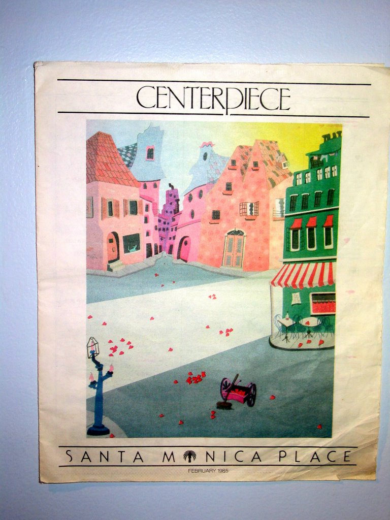
left: Front and gift certificate of greeting card

right: interior and gift certificate in diecut holder

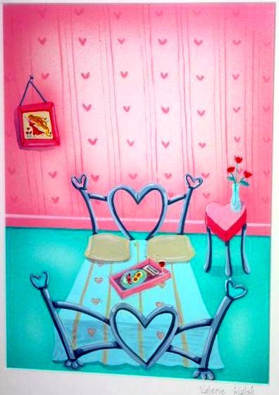
center: original art "Afternoon delight" 1996