Thursday, February 02, 2006

Valentine 2


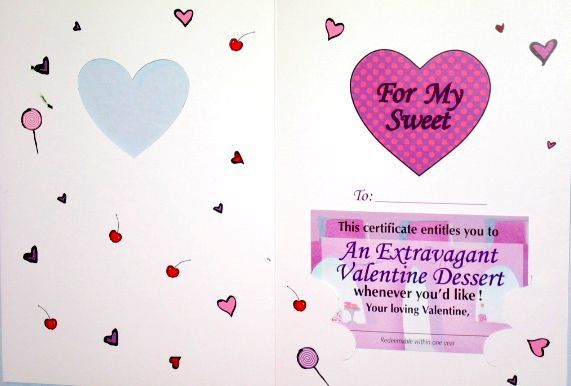
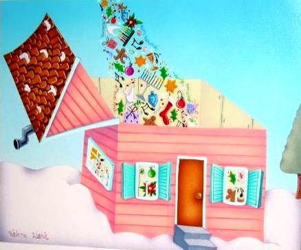
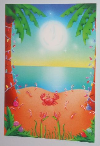
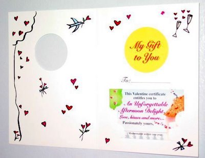
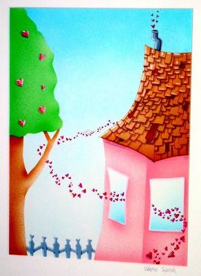
All of the Marisol Valentines that I made were for adults and have slight adult themes which I am sure you could tell by yesterday's "Afternoon Delight". Even so, I made them with a happy, fun and whimsical touch. This valentine is more relevant to everyone. These cards that have the certificate in the diecut holder are called Hidden Treasures.
top: greeting card middle: interior with gift certificate bottem: original acrylic on airbrush paper copyright 1995

Wednesday, February 01, 2006

Valentine 1


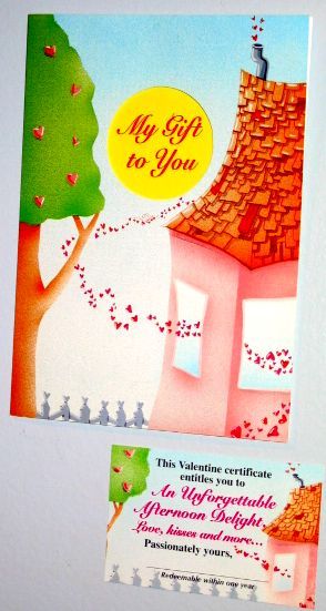
"Afternoon Delight"

I love Valentines. It's not about the holiday or receiving them or any of the mushy or commercial aspects of Valentines day. I frankly find all of that annoying! It is the remembrance of things past, of when we were small and we bought those boxes full of cards and made one for all of our friends and the teacher would set aside some time to be together and open them, read them, eat candy together and laugh and swoon about the cute boy that gave me one...

I have made at least 100 different images for card companies to be used for Valentines. I love making them even more than receiving them. I wanted to show some examples of the unique cards that I have made for this occasion. The example I am showing today is by Marisol Inc. The reason I loved doing cards for them is that they would send me a sheet of words and I got to create whatever I could dream up as long as it fit within the template and utilized the words. I would always try to fit a house in the picture which was not easy but for this Valentine it really worked well. For Marisol's everyday line and Valentines I was required to make 4 individual pieces of art. The front of the card, the diecut that was in the upper center of card, the mini card that fit into the lower diecut portion and the doodles that went in the interior of the card. So if I made 10 Valentines, I really made 40 pieces of art to make up the whole 10 cards. The advantage of making them this way was in the end the front cover was painted without the diecut so I could utilize it for other things or frame it and it was a piece of art.

left: Front and gift certificate of greeting card

right: interior and gift certificate in diecut holder

center: original art "Afternoon delight" 1996

Friday, January 27, 2006

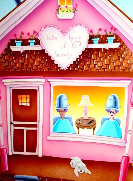
Illustration Friday: Glamour


Glamour is really a state of mind! If you feel glamourous you are. This is a painting from my 2002 HomeMade calendar. The title is "House of Beauty". It is a country home beauty parlor. That is my mom Barbara wearing the glasses and her much loved poodle Pepi. Pepi is no longer with us so I am glad that I used him in this scene. My mom loves girly things and glamour and this is a tongue in cheek portrait I did and when it was published in the calendar she was thrilled. We call my mom Babs, just like the cat in most of my illustrations and so I made "Babs House of Beauty".

copyright 2001


Tuesday, January 24, 2006

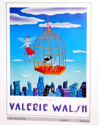
"Five o' Clock..."


In 1983 I painted"Five o' clock..." My publisher felt that it would be a great image to use for my 2nd poster. She thought every secretary would relate to this image and buy one. This idea came from my experiences working in an office. When I was 20 I went to an agency to try to get a job. I was hired instantly by a company at the Pacific Design Center. It was a company that sold modular systems for working environments. They liked my voice so I answered phones in a cubicle, a little light typing and followed up on leads for the sales executives. It was dull and boring, especially working in that little cubicle. This is how I felt at "Five o'clock..." when I would leave this cage, remove the shackles and fly out the door. Not a care in the world. I could leave this job and not bring home any baggage...

The poster was printed and distributed in 1985 and in 1989 I was thrilled to land a puzzle deal with Yamakatsu in Japan. This image along with 3 of my other paintings were made into these amazing puzzles that were popular there. Many years later when I had a greeting card deal with Marisol, I revived this theme in a card for the every day line I created for them. It was a card that had a gift certificate and awarded the recipient to leave work one hour early! The girl in this poster/puzzle was originally conceived for one of my first commercial jobs used on a container for "Beverly Hills Bagel Chips" in 1981. So she went from a container to an idea for a poster, puzzles and then a greeting card. I got a lot of mileage out of this one idea that spanned over a decade!

right: Marisol greeting card copyright 1994

center: Yamakatsu puzzle copyright 1989

left: poster copyright 1985

Friday, January 20, 2006

Illustration Friday: Cat


This is my submission for cat. I use this cat in a lot of my work and her name is babs. This illustration comes from my 2004 HomeMade calendar and the title is "Alpine Haus". I include a spot illustration and a quote on the page that holds the days of the month. I love this quote: Her house... was as pretty as narcissus in the snow, as pretty as a silver feather on a pane of winter glass. -Beverly Nicholson

copyright 2004

Tuesday, January 17, 2006

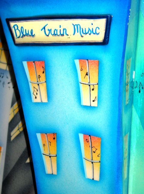
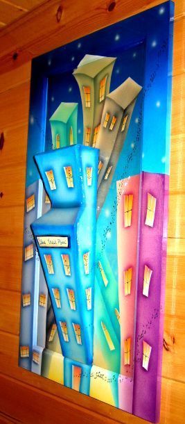
BlueTrain Music


In 1995 my husband John Hartmann started a music management company with Gary Katz and Gary Stromberg. It started out as Blue Train Music and later became Jake Records. Gary Katz produced all of the Steeley Dan Records and he worked with Joe Cocker and Diana Ross too. Gary Stromberg is a veteran publicist and his clients ranged from Muhammad Ali to Barbara Streisand and he wrote and produced the movie "Car Wash". John Hartmann has managed such luminaries as Peter, Paul and Mary, Crosby, Stills, Nash and Young, Eagles, Jackson Browne, America and Poco. John ran the west coast and Gary and Gary ran the east coast division in New York. John released 8 albums and the last album he executive produced is the one that I want to focus on. It is an album called "Session 55" 1936-2000 Les Brown and his Band of Reknown. This was the last album that Les Brown recorded before his death on Jan.24, 2001. Les Brown and the band brought a young Doris Day into prominence with the song "Sentimental Journey". They were the house band for the Dean Martin Variety Show and the Steve Allen Show. Les performed with virtually every major singer of their time which includes Frank Sinatra, Ella Fitzgerald and Nat King Cole. The release of "Sentimental Journey" coincided with the end of WWII in Europe and was the homecoming theme for many veterans . They had 9 number one hit songs and performed with Bob Hope and did 18 USO tours for troops around the world. Tony Bennett was discovered by Bob Hope and did his first public performance with Les and the Band. Session 55 is a wonderful album and it was an honor to meet Les and see him perform with his son Les Brown Jr. and brother Stumpy also in the band. This particular album featured two guest singer/performers. One is a young and extremely talented and beautiful jazz vocalist named Jane Monheit and the other was Lou Rawls. Lou Rawls was the quintessential performer. We met him at the studio and he did two songs in two takes, period. He didn't even need to do two takes as the 1st take was perfect! His voice was so unique and there is nobody that sounds like him. The guy was such a pro and the nicest man you could ever meet. He is a legend and I know he is missed. I feel lucky to have met these amazing talents and see first hand how accomplished they were and even at the latter part of their lives they were creative and on their game.

This is a dimensional painting I created that was housed in the lobby of Blue Train/Jake Records .

Friday, January 13, 2006

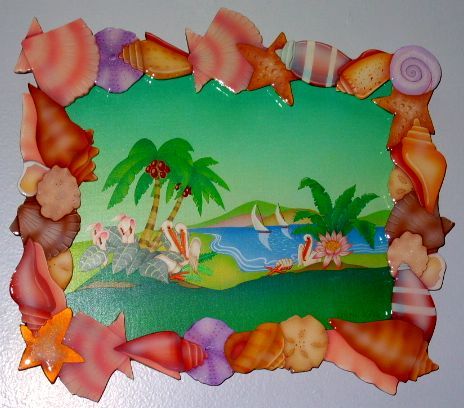
Illustration Friday: E is for Enchanted Isle


My submission for IF is "Enchanted Isle". I have posted it on my blog in the past and I created this for my show last summer. This is a painting I wanted to do for so long and I set aside some time in May 2005 to really focus and make this seashell frame that I had initially created for a commissioned painting that was quite large, but I wanted to make one for me. This frame is made from one piece of formable foamcore and I cut it out with an exacto knife by hand. It took a couple days to cut out. Then I paint each individual shell and pour a resin over the whole frame. The painting is acrylic on masonite. I do all of my paintings on gessoed masonite. You might notice not a building in sight
and that is because I love the ocean too!

Wednesday, January 11, 2006

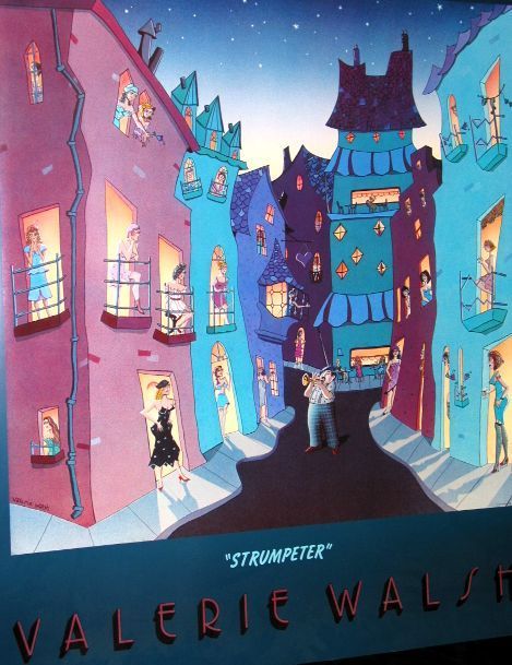
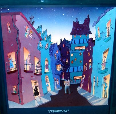
Strumpeter


I got a publishing deal at 22 years old with a company called Luna Art right in the heart of Venice Calif. I was the youngest artist signed and I was in amazing company. Luna's roster of artists included Michael Bedard, Siegbert Reinhard and James Paul Brown. This was the 1st poster that I had printed with Luna and it was not a hit by any means but it was popular and my publisher Michelle Hancock sold the original at Art Expo in New York for what was a lot of money to a young artist. It was a thrilling time. The print market in 1982 was really happening in Los Angeles and there were a lot of galleries as well. So business was good, posters are a great way to advertise art and your name in a tasteful way. The limited edition market was very strong too. People always find me and ask if I am the artist who created "Strumpeter" and it feels like a life time ago but I am proud that I made it and that people like it. Some think they know where it is but they don't. It is a trumpeter serenading all of the strumpets.

Monday, January 09, 2006

Night Hawk


In 1987 I worked in Santa Monica for master printer, Jeff Wasserman of Wasserman SilkScreen Co. I worked with 4 -5 guys . I was the only girl and I really enjoyed being one of the guys. I worked there for 5 years. We printed limited editions on paper, metal, glass and fabric for some of the most well known California artists that were in the museums and the important galleries at this time period. But life at the print shop was pretty routine on a daily basis. One evening I went out to the alley in the back and there was a large hawk sitting on top of the telephone pole and all the people that were walking by and worked back there, were marveling at the sight of this large hawk in the middle of an industrial area! It was a beautiful sight. "Night Hawk" is my reflection on that day but I changed it from industrial alley to a neighborhood. I did this for a young woman, her mom purchased and comissioned a few paintings from me. I had a show in Pacific Palisades Sept. of 1990 and used it for my invitation and as a centerpiece for my show. In Topanga, you see hawks all the time in fact there is a piece of state park property right next to me and they mate and have babies in the eucalyptus trees. The hawk is such a beautiful bird. I have noticed since I started blogging a few other pictures of birds on phone poles, I think Andrea might have one on flickr and someone else too...

Friday, January 06, 2006

Illustration Friday: Light House

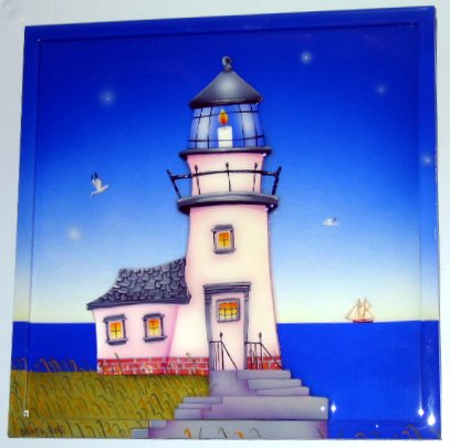
This is my submission for " Sea " on IllustrationFriday. The title is "Light House". I have painted this in many formats. I did it as an illustration (paint on paper for my Homemade calendar.) This version is a flat dimensional painting with frame and resin. The Light House is made from wood and it has several layers of dimension. The railing up top is made from carved matchsticks with a fabric cord to replicate rope. I always incorporate the frame as part of the painting and with these layered paintings I always pour a polymer resin. Sorry for the highlights and the crop job but since this piece is hyper-shiney it needed to be photographed at an angle to reduce white spots and glare.

I love the sea and I love painting it too.
copyright 2000 not to be used without permission
Posted by Picasa

Wednesday, January 04, 2006

Graceland

This painting is a houscape of Graceland . Graceland Chapel is in Las Vegas. The building looks just like this but the grounds don't look like this at all! We eloped to Las Vegas and got married before a gig at the Hard Rock Cafe (John managed a band called "Common Sense" at the time and they opened for "Hootie and the Blowfish" New Years Eve 1996. We chose Graceland because when John was 21 he worked for Col. Tom Parker (Elvis's manager) and even though the Col. was a tough guy I think John really respected him. He also met Elvis and spent a day once wearing Elvis's gold lame dinner jacket. John loves Elvis!!! He wanted to have an Elvis impersonator marry us but I had to put my foot down and we just had a regular ceremony. Believe it or not it was so heartfelt and sweet! We threw a charming reception several months later at the Oceana Hotel which is a very small hotel on Ocean Avenue in Santa Monica. Our family and friends attended and fun was had by all! I made our reception invites and this was the art on the cover. The little marquee in front normally says something like Lorenzo Lamas got married here but I painted Valerie and John were married here. Posted by Picasa

Friday, December 30, 2005

Illustration Friday "Flavor"


When I think of flavor I think of coffee. I love coffee and it loves me! I don't go in for all these fancy coffees, although if I am out and there is
a cappucino machine I won't say no to a nice latte. I just go in for regular filler up ding ding good old fashioned coffee. This illustration is from my 2004 "HomeMade" calendar. Yes, you guessed it "Coffee House" is the title.
Cups grow like flowers waiting to be filled. And donuts and cookies grow from vines! The coffee is percolating in the lid and it looks like another happy day.

Sorry to all that came by this past week, I needed to amp up my work schedule on the houscape that I am painting and the holidays are the optimal time to crank on my workload. I won't be posting until after the 1st. The 31st is also my 9th wedding anniversay and 12 years together. John, Rat and I wish you all the happiest of celebrations! Have a prosperous, creative and loving New Year.

copyright 2003
Posted by Picasa

Friday, December 23, 2005

Illustration Friday Holiday

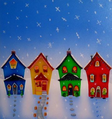
The title of this painting is "Celebrate the Holidays Together"
It captures a neighborhood that is diverse. Hanukkah, Feliz Navidad, Kwanzaa and Christmas. Sorry if I forgot anybody. Diverse like all the artists that participate at Illustration Friday. IF has been a highlight this year! I feel as though I have made new friends. We don't criticize, we praise and inspire each other! It's a wonderful thing! Happy, Merry everyone.

copyright 2000 may not be reproduced without permission
Posted by Picasa

Thursday, December 22, 2005

Greetings!

I thought I should post another greeting card today. I have not been as good about it as promised but it is a busy time. I will try to post my walk through my forest in the New Year and I will try to name one more for the tag . Carla is hoping to try to participate too! I will need to name one more artist. Any volunteers? Have a cozy evening! inside reads: Wishing you warm winter moments and bright Christmas memories

copyright 1994 Marisol Inc.
 Posted by Picasa

Tuesday, December 20, 2005

snowgirl

I have collected ephemera for quite some time. I love vintage paper goods , it reminds me of all the wonderful parts of childhood. This card is from my applesaucey kids line of cards and boxes, it is a homage to vintage images of children with a little valgal thrown into the mix! Brrrrrrrr, baby it's cold outside! Posted by Picasa copyright 2002 applesaucey kids

Friday, December 16, 2005

Illustration Friday: Imagine


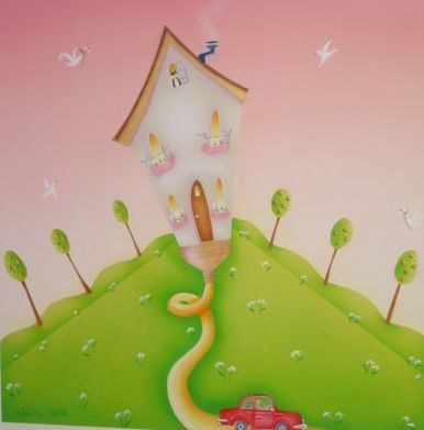
To me being an artist is all about the imagination! "House Paint" is from my 2004 "HomeMade" calendar.
copyright 2003 May not be used without permission of the artist
Posted by Picasa

Thursday, December 15, 2005

Tag


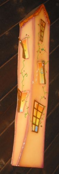
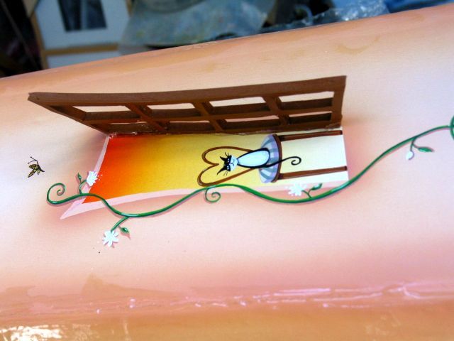
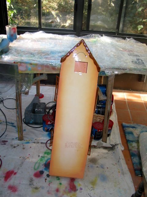
I have been tagged by Scott and Eni to talk about a type of work that takes a long time and about the process. The hard part was deciding which type of work I would choose because just about all the work I do takes a very long time to create. Once or twice a year I get commissioned to do one of my 3-d buildings that is a sculpture and a clock. They are very unusual and I have done many shapes and sizes. One of the styles is pretty popular and I think it is the shape, colour and the shutters that appeal because I seem to get more orders for this one. It looks like a flying building and it is whimsical. These buildings are so labourious and I am at the end of this one so I can only show you the ending stage. But it starts out as a blank white sheet of formable foam core. Then I randomly create the shape. I have to fill in all the edges and open seams with modeling paste, it takes hours & hours of filling in the paste, letting it dry then sanding . Just like drywall and spackle in a regular building only this is the mini version. I paint an overall colour and then I spend hours cutting out shutters and painting all the details. My buildings are between 3-5 ft. long and 6 inches wide. I create a room inside that houses the body of the clock.The back of the clock has a hinged door to change the battery and to make time changes. I paint the clients cats, dogs , flowers, books, furniture and pictures in the windows. I pour a two-part polymer resin on each side of the clock that makes it look like shiny candy, sometimes I need to pour more than one coat per side. The resin takes days to cure. It is an enormous undertaking but I enjoy making them in between my drawings, paintings and illustrations. It would be difficult to gauge how many hours go into these clocks but needless to say it is a lot. I stopped trying to figure out by the hour a long time ago because every piece of work that leaves my studio is like a piece of me and I take great pride in making it the best it can possibly be no matter how long it takes. It would be upsettting if you commissioned me and I ran out of time because you paid only X amount of dollars. So when people ask if I make a living at this I smile and say it is my life.

The finished clock is different than the one in my studio. The finished clock is hanging in a restaurant in Topanga called "Roccos". M y artwork has been hanging in this restaurant for over 20 year. It is like my private gallery and people get to enjoy it along wih their Italian meals. The clock in my studio is unfinished it has a coat of resin on the back and is ready for the front to be poured. The finished clock at Roccos is 6 ft. long. I always put a special quote about houses on the back of the clock.

copyright 1997

Wednesday, December 14, 2005

Toystore


I am a firm believer in visualizing what you want. Ever since I can remember I have created what I wish for on paper. Sometimes creating something visually can be as rewarding as having a material thing. Of course when I was little I was not the painter that I am now, but I would have liked my own Toy Store!

Inside reads : Wishing you many happy surprises during the holidays

Marisol Inc. copyright 1994

Tuesday, December 13, 2005

snow fairies


This was another card for the owners daughter. I really enjoyed painting these little Snow fairies hiding in the woods.

inside reads: wishing you a magical holiday

Marisol Inc. copyright 1994

Monday, December 12, 2005

Sugarplum fairies


The owner of Marisol asked me to make a couple of illustrations for holiday cards that used Nutcracker themes because her daughter was so in love with the story and characters, so I was happy to oblige. When I was little I wanted to be a ballerina too. I enjoyed painting this little scene.

inside reads: wishing you a holiday season of joy and wonder

Marisol Inc. copyright 1994

Friday, December 09, 2005

Illustration Friday: Surprise


Artwork entitled "Open House" created for a Christmas card in 2002. Inside card reads: Celebrate the Holidays Together! It incorporates Kwanzaa, Hanukkah, Christmas, Feliz Navidad and Peace. I try to make all my holiday cards appeal to all denominations.

Wednesday, December 07, 2005

Topanga


This is what I see outside my airbrush studio. It is the most beautiful bridge that leads to nowhere. Underneath is a creek that rises when it rains. Rat loves to splash around there. I would take some closeups but this odd man recently put up a fence (I don't think that is even legal) he lives above it and was worried that kids would play on it. A long time ago an opera singer had a home on this property but it burned down. There are lots of properties here where the houses burned down and the State bought the properties as fire breaks so I am completely surrounded by State Park. This is great because not only do I live in a State Park but no one will build near me. This is nice because I do live in L.A. but where I live you would not know down the hill is Los Angeles. What's down the hill is actually Santa Monica and Malibu and the other side is the San Fernando Valley. It is perfect for Rat because it is one of the last places where a dog can run free. Although the park technically does not allow dogs on the trails anymore. I have lived in this canyon for 27 years. It is changing and it makes me a little sad, but that's the way it goes. Way too many people use Topanga as a thoroughfare to the Valley so they won't get stuck on the Freeway. It is such a beautiful drive but it is most unpleasant at rushhour now for oldtimers like me. I work so much that I am in my studios most of the time. The Houscapes that I do are difficult because they are extremely personal and because they represent the person who lives in them it is crucial that I put a large amount of time into them. I will post my walk thru the park in the next week.

all is calm


I had a friend when I was young who went to Tahiti for Christmas. This sounded like the most exotic trip in the world to me. When she got back, she was brown as a berry! I was fascinated by her stories of Tahiti. Maybe some day I will go...

When I painted this card, the owner of Marisol added quite a few more candy canes to my picture, she did it with the computer (not on my original).She did this to a couple of the Christmas Cards. They were already printed by the time I discovered it but she told me she wanted them to look more festive. I like open space. I don't feel like you have to fill every part of a picture. I like the less is more approach. Now in retrospect I find it funny that I even gave it a second thought.
inside reads: all is calm, all is bright

1994 Marisol Inc.

Tuesday, December 06, 2005

JOY


This is my idea for JoY! I did this card and
yesterdays post with the same greeting card company,
Marisol Inc. Another one of those dream jobs where she saw my work in Colorado, tracked me down and asked if I wanted to join her company. They came to visit me in Topanga and brought me specs on their everyday line. This was a template and the words to be used in each card. So I got to create whatever I wanted as long as it went with the words! I would send the artwork to Colorado once a week and I would receive a cheque with my originals. It was the perfect blend. I loved working for Marisol and we made cards and stationary for quite a few years.

inside reads: From our home to your home with warmest holiday wishes


copyright 1993 Marisol Inc.

Monday, December 05, 2005

Peace


I have made hundreds of cards for every occasion. They were made for greeting card companies, business's, individuals and my own lines. I really enjoy creating art for cards and you usually do winter scenes in the summer. It's boiling outside but you have to conjure up snowy cold scenes. I will try to post a holiday card each day to celebrate the season. I will show a small sample of my favourites.

inside reads: on earth goodwill to all mankind.

copyright Marisol Inc. 1991

Friday, December 02, 2005

Illustration Friday "blue"


This illustration is my logo. I love my logo, it is another signature image that crops up in my work all the time. A house that is a gift! Also blue is my favourite colour.

copyright 1996