Thursday, June 30, 2011

Illustration Friday: MidSummer Knight


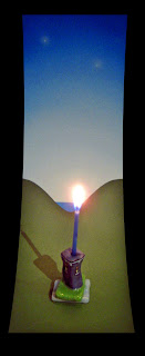
My submission for Illustration Friday's Midsummer Knight :)

Liquitex Acrylics on stonehenge with a little thread and glue.
MidSummer Knight's Dream 2011 valerie walsh


A gentle knight was pricking on the plain.
~Edmund Spenser~  1590 The Faerie Queen


Thursday, May 26, 2011

Illustration Friday: soaked


I posted this image here and I talked about how I came up with this idea. But did you know that it was not just a painting it was also a T-shirt ;)


My submission for Illustration Friday's "soaked" theme is " Singin in the Rain" created in 1995.


Saturday, April 16, 2011

Illustration Friday: journey


I like to dream yes, yes, right between my sound machine

On a cloud of sound I drift in the night

Any place it goes is right

Goes, far, flies near, to the stars away from here


Well you don't know what we can find

Why don't you come with me little girl

on a magic carpet ride

You don't know what we can see

Why don't you tell your dreams to me

Fantasy will set you free

Close your eyes girl

Look inside girl

Let the sound take you away


Steppenwolf


A newer version of "Magic Carpet Ride" 2010 Acrylic and Resin on wood and wood panel

Saturday, April 09, 2011

Illustration Friday: bottled


I have created a few wine labels and it is something I really enjoy. I don't drink, but I find it very appealing to make a piece of art that people get to look at while they are relaxing and having fun! They are feeling good and hopefully looking at your art and taking the time to notice the little details ;) My submission for Illustration Friday's "bottled" theme is a wine label for a father/son wine making venture up here in Topanga. This label was made for a competition they were entering in the hopes of cash prize to possibly fund their endeavours. I had a very short period of time to paint something that gives the impression of rustic and homemade.

Thursday, February 24, 2011

Illustration Friday: layer


Screen printing is all about putting a layer of ink on paper. Layer upon layer upon layer. This is a screen print I made using waterbased inks which at the time I made this was a relatively new thing. We always used oil based inks at Wasserman SilkScreen Company and we had to use stinky solvents to clean up the screens and squeegee. This print has 9 layers of ink, one is a transparent white that turns 9 colours into 18 and the darker ink that has a textured look was used as a shadow colour and it has transparency in it. I created the texture effect by drawing with a special crayon on frosted mylar that has a bit of tooth to it, making the crayon stick to create some nice textures. Handprinted all by my lonesome, I use a little kickstand on the side of the screen and just print away :) Registration is key! :) My very late submission for Illustration Friday's "layer" theme is a screenprint on rag paper (stonehenge) called "Shooting Star".

Saturday, January 29, 2011

Illustration Friday: surrender

Here we are a few days later and I have poured resin on the painting and it is sealed and very shiny. It heightens the colour in one way and it also adds a layer of depth to the painting too. I have to always intensify the detail because the resin softens all of the fine handwork and creates an even dreamier image. For me this image is really called Tree House because this is what it is, a California Redwood! valgalstyle :)


" If you surrendered to the air, you could ride it" ~Toni Morrison


My submission for Illustration Friday's "surrender" theme is a dimensional painting. Liquitex acrylics on wood panel with wood frame, foamboard building, handmade paper shingles and clay chimney and door handle. The painting is called Home in the Woods.

photos and art by Valerie Walsh 2011

Tuesday, January 04, 2011

Illustration Friday: resolutions


This is a "houscape" I did for a lovely woman in Sherman Oaks in 2010. She works in the field of music for major motion pictures and I am proud to have captured her home and I made the frame for the painting too. It is actually dark green but hard to tell in my photo. My resolutions are few but I resolve to do more unique and interesting projects if possible this year and see where my artistic adventures take me... My submission for Illustration Friday's "resolutions" is airbrush acrylic on wood and it is called "Dixie Canyon" :)


photos and art valeriegallerie/valeriewalsh


Friday, December 10, 2010

Illustration Friday: phenomenon


My submission for Illustration Friday's "phenomenon" is my Holiday card this year. I decided on a non traditional colour scheme to make it a little different and special :) I have been making cards for 30 + years in every combo of colours and so each year I try to make something a bit out of the ordinary.


Thank you to all the folks that came by this year to see my art and ideas! I was a little lax in posting this year and my fifth year of blogging here passed by and it means so much that you visit and check out my stuff and comment :) Thank you and have a lovely holiday season too!

Nowadays, "phenomena" are often, but not always, understood as appearances. They are themselves sometimes understood as involving qualia.

Wednesday, November 10, 2010

Illustration Friday: afterwards


This little house started out as an illustration on Arches and is printed and diecut and afterwards it becomes a garland of houses. It has one side that can be folded which enables it to stand alone or in groups and I used non-traditional colours for the holiday or anytime. Notice you slide the ribbon through the open windows :)


Thursday, October 21, 2010

Illustration Friday: spooky


Somewhere in the Transylvania countryside is the idea behind my submission for Illustration Friday's "spooky theme. I love this word so I did this last minute quick and dirty on stonehenge using acrylics and prismacolor pencils;)

2010 valerie walsh

Monday, October 04, 2010

Illustration Friday: beneath


This paperhouse is painted with acrylic paint, i used thread to hang the paper star, fashioned a clay doorknob and of course it all starts with a small matchbox ;)
all photos and art valerie walsh for Illustration Friday's "beneath" theme

Wednesday, September 22, 2010

Illustration Friday: acrobat


My submission for Illustration Friday's "acrobat" is a painting I have done many times in many ways for lots of peeps. This is a version I did to a song by Los Lobos :) You know the saying "once in a blue moon" which means seldom or rarely? Well this is a lavender moon and that means as rare as it gets! The title of this painting is "Balance" which is required when you are an acrobat ;)

valerie walsh 2010

Wednesday, September 08, 2010

Illustration Friday: dessert

Did you know that a goat would consider a flower dessert? And deer do as well :) I have friends that raised goats in Topanga and the goat really will eat almost anything! They would stand on the roof of their shed which gave me the idea for this illustration. Many times I see deer and they are grazing on my neighbour's newly planted flowers or fruit trees and vegetables... It does make me smile and it has happened to me many times as well, it is always the same feeling SURPRISE!!! :D
This is a colour study for a painting called "House Pet" and I made this drawing in 1990 and did not use this idea for a painting until my 2004 HomeMade calendar. I changed the building and colours to pinks and greens but I have always enjoyed blue and purple together very much :) Was hoping to make something new because I love this word and have a good idea too but the time got away from me so this is my very late submission for Illustration Friday's "dessert" theme.
all photos and art valerie walsh 1990-2004 prismacolor pencil on stonehenge

Saturday, August 21, 2010

Illustration Friday: atmosphere


My submission for Illustration Friday's "Atmosphere" is a dimensional painting I made for Dee Dee, my sister in 1995. It is wood, formable foam board, acrylic paint and resin. This was a bit of an experiment in several ways, I wanted to go beyond the traditional shapes of paintings and create leaves that give the piece dimension sort of jutting out curving around and also by painting part of the leaf on the surface to add a faux visual continuity for the eye. I made a few of these round layered pieces and really enjoyed this look. This flower girl is saying "I like the air up here". What does it mean? I don't know it was just fun to make, love the colours and I like it :) sorry about the glaring white spot, I took this picture at my Mom's house. She has an entire room dedicated to my art and it is a Valerie Gallerie of sorts and this was sitting up on a shelf so I did the best I could because I frankly had completely forgotten about this image.

I am not sure if they make this foam board anymore I bought a ton of it and you could wet it and it would form easier into shapes that I wanted to make. I never see it anymore so I imagine it was not so popular, but it worked for me. I have found through the years that when I like a product I buy a lot of it because many art supplies tend to get discontinued...

Saturday, August 14, 2010

Illustration Friday: Star gazing

I have created hundreds of paintings in my 30+ years as an artist that feature or incorporate stars. This image was commissioned by a very close friend and she looked at my portfolio and chose to have me make a bridge painting that would include her husband, son and herself in the buildings. She likes very soft muted colours which is always a challenge as I tend to be quite colourful :) Yes this is subtle and subdued for me... She really loved the softness and the pastel quality of this and it is large and one of my layered dimensional paintings with resin. I did this in 2000 and I am always happy to paint something special for someone I care about. It is called "connection to love" and it is my submission for Illustration Friday's "Star gazing" theme.
valerie walsh 2000

Thursday, August 05, 2010

Illustration Friday: artificial


My submission for Illustration Friday's "artificial" theme is a facade called Home Front. This is a tough word for a homemaker :) I thought of a house in Florida with all the pink flamingos out in front but this has been done a million times or maybe an artificially sweetened Gingerbread House but I posted the real sweet kind before ;) I decided on this idea, as you can see; I finished down to the wire because I am working on other stuff but the idea is reminiscent of the old saloon type buildings propped up in the back.


art and photos valerie walsh 2010

Wednesday, July 28, 2010

Illustration Friday: double

When I paint illustrations for cards, calendars and stickers I often have to make 2 of the same image and sometimes 4 if it is a seasonal item. I have a game I play with myself to see if I can make them look identical. Sometimes I have to make the same item in reverse and I enjoy this as well. Here are some examples of my submission for Illustration Friday's "double" theme.

1. Love Grows (greeting card)

2. Homes for the Holidays Stickers (spring/summer)

3. House Paint stickers (LOVE & Happy Birthday)


Wednesday, July 14, 2010

Illustration Friday: diary


I got quite excited about this word :) What sprang to mind is "Diary of a Mad Housewife" so I decided to make a moleskine into a house and use the idea of the text viewable through the door and windows ( I have done this before and loved it!) This helps the diary resemble the cover for Sue Kaufman's book. My version and my writings are modified from the original of course and illustrates the madness that plagues me in my constant creating of buildings and homes. My submission for Illustration Friday's " diary" theme is a journal called "Diary of a Mad HouseMaker.

photos and art valerie walsh 2010

Sunday, July 04, 2010

Illustration Friday: Giant


When you live in LA you tend to get asked to do a lot of unusal jobs. I have had my fair share of unique opportunities and I welcome them :) This illustration is from one of those very times. This took place in 1990 at Sunset Tower Hotel in Hollywood. It is a landmark hotel and in those days The St. James Club of London and Antigua bought it and operated it as such. My friend was the head doorman and asked if I could make a special remembrance for Whoopi Goldberg because she loved the hotel and had been staying there for some time and he wanted me to make a quick valgal version of the hotel to make her feel special. I only had a day to paint and I wanted it to look like the work I was into at the time. I was making 10 layered dimensional towers and castle-like structures for a show in Santa Monica. This illustration was mounted on a lovely thick piece of paper that I made. This place is considered a giant among the old art deco buildings and many wonderful people have stayed here including my mom and me :) we had a delightful and memorable time there.
Please watch this short film about Sunset Tower Hotel.
valerie walsh 1990